The Quiet Logic of a Stadium Threshold
Stadium threshold design can make arrival easier to read, from the first approach cue to the point where visitors know which way to go inside.
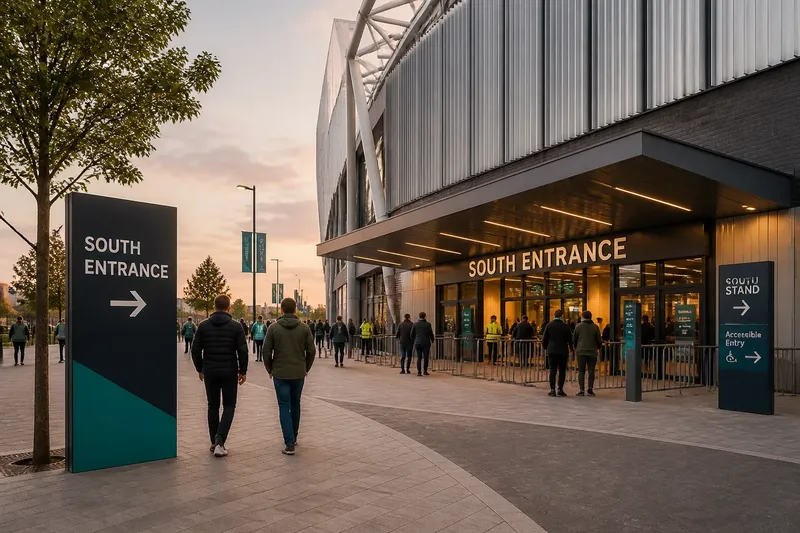
How can stadium threshold design help a visitor know they have reached the right entrance, and what happens after they cross it? The answer lies in a short sequence: the approach identifies the venue, the entrance confirms the visitor’s choice, and the first space inside points towards the next destination.
Threshold sequence
A stadium threshold is the chain of spaces and cues between the surrounding street and the venue’s interior. It may include a forecourt, ticket check, doorway, turnstiles and the first stretch of concourse. The door is one part of the sequence, not the whole event.
Different visitors read that sequence differently. A regular may recognise a stand from its shape; a first-time visitor may rely on a ticket, a steward or the name on a sign. The design should support both without making either person decode a fresh vocabulary at every point.
Think of the threshold as an arrival sequence with three jobs: establish that the venue is near, identify the entrance that applies, and confirm the next move once inside. Architecture, signs, lighting and staff can share those jobs. No single canopy or sign needs to carry the entire performance.
Approach decisions
The approach should identify the public entrance before visitors reach a barrier or security check. A forecourt edge, canopy, change in paving or clear view of the entry can distinguish the venue’s arrival route from an ordinary pavement. If a row of similar doors meets the street, a visitor may reach the building without knowing which part to use.
Public ticket holders, staff, hospitality guests and delivery vehicles may have separate routes. Show the distinction where people choose their direction, rather than after they have joined a queue. Use the same names as the ticket and event information, so “South Entrance” does not become “Gate C” at the barrier.
Look for the view from each likely direction of arrival. Trees, event barriers, parked vehicles and sponsor boards can conceal a sign that is otherwise perfectly present. Leave a place off the main route where someone can stop to check a ticket or meet a companion.
Stand at the point where visitors first see the venue and note what they can actually identify.
Entrance cues
An entrance is recognisable when its location, appearance and information agree. A prominent door without a sign may look private; a large sign above several identical doors may name the venue without identifying the right one. Link the visual emphasis to a clear instruction.
A deep canopy can mark the public entry and offer shelter. A façade change can distinguish it from nearby service doors, while glazing may reveal activity inside. These features help only when they support a usable route. A striking arch over a locked door is a memorable lesson in misplaced confidence.
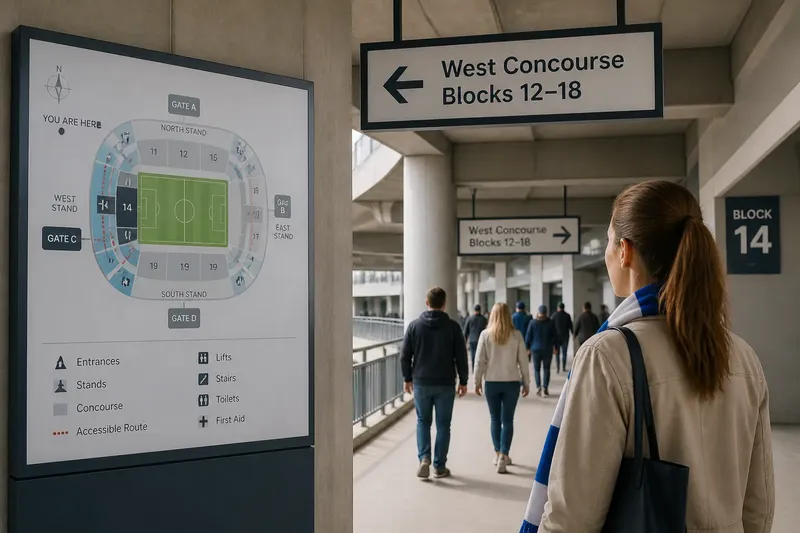
Place information according to the decision a visitor must make. At the approach, name the entrance or stand. By the ticket check, identify the lane or assistance point. Keep each sign focused; visitors may be reading it while checking a phone or keeping track of children.
Say you arrive at a fictional stadium with north and south entrances, carrying an invented ticket for the south stand. You see “South Entrance” on an approach sign before the barriers, then the same stand name beside the entry. The decision is clear before the queue begins, and the repeated wording confirms rather than contradicts it.
Boundary conditions
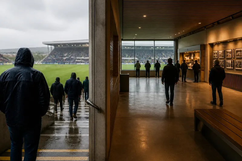
The boundary should be perceptible without making visitors guess where public space ends. A change in floor finish, ceiling height, lighting or sound can mark the move indoors. The shift need not be dramatic; it should confirm that the visitor has passed into the venue.
Materials affect how the transition works. Outdoor paving may meet a smoother interior floor, while a sheltered soffit leads into a more open concourse. Check that the join does not create a slippery patch, catch wheeled bags or collect water. Those are practical details, not decorative quibbles.
Lighting should keep the door, signs and people visible as visitors move from daylight into a covered space. A bright sign against a bright sky can lose contrast; a dark doorway can appear closed. Avoid glare that makes it harder to read a sign or speak to staff.
Sound changes, too. Traffic may fade under a canopy while voices and public-address announcements become more prominent inside. If amplified sound masks a steward’s directions at the doorway, the atmosphere has begun to interfere with the instructions.
First interior cues
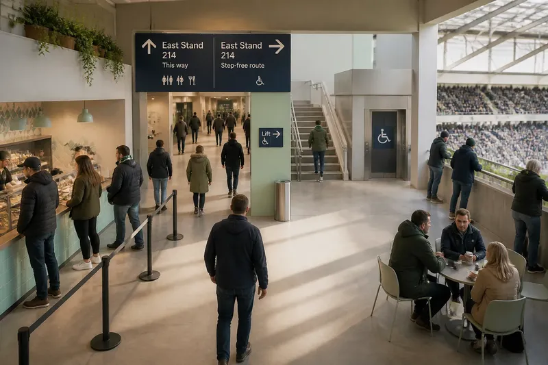
The threshold is not complete merely because a visitor has passed through an entrance control. The space beyond should show what comes next: a stand, concourse, service point or accessible route. A clear view or a well-placed sign can do this without filling the doorway with messages about the entire venue.
The first interior view carries useful information. A visible concourse or sign to the relevant stand supports onward movement. A blank wall, a cluster of doors or a queue that hides the route can leave the visitor uncertain about whether to stop or continue. A landmark helps when it is visible from the entry and does not direct people through a restricted area.
Different venues need different sequences. A compact ground may lead directly from the street to seating; a larger stadium may use a forecourt and several checks. The useful test is whether each change of space has a clear purpose for the person moving through it.
Arrival questions?
Should the main entrance be the most prominent?
Make each public entrance prominent to the people expected to use it, especially where entrances serve different stands or ticket groups. Otherwise, visual emphasis may send everyone towards one door by default.
Can signs do all the work?
No. Signs can identify a route, but they cannot make a blocked path usable or distinguish doors that look identical. Pair directions with visible spatial cues and a route that remains clear.
What information belongs outside?
Show which entrance to use, where the relevant queue begins and where to ask for assistance. Directions for later parts of the journey belong near the point where visitors need to choose.
How should accessible entry be signalled?
Make the step-free route and assistance point visible from the approach, rather than sending visitors to search after reaching an obstruction. The precise provision should follow the venue’s design, applicable access requirements and event arrangements.
Pre-opening decisions
Temporary barriers, steward positions and event boards can change a route that seemed clear on a drawing. Walk from the public approach to the first interior destination in the actual event arrangement. For each item below, observe the stated condition and make the corresponding change if it appears.
- Approach view: Check whether the public entrance is identifiable from the normal direction of arrival. If it is not, move an obstructing object or add a sign before the point where visitors choose a route.
- Entrance names: Compare the wording on signs with tickets and event information. If the names differ, align them across those materials; if they already match, keep the shared wording.
- Queue start: Check whether visitors can see where each public queue begins without blocking the walking route. If the start is unclear or obstructive, reposition barriers; if it is clear and leaves room to pass, retain the arrangement.
- Accessible route: Check whether visitors can see the step-free entrance or assistance point before reaching an obstruction. If not, bring the information forward and make the route apparent; if it is visible, preserve that sightline.
- Interior direction: Check whether the space beyond entry control indicates the next destination. If it does not, add a sign or reveal a relevant landmark; if it does, avoid adding redundant instructions.
- Temporary displays: Check whether event boards, sponsor displays or security equipment obscure a door or sign. If they do, move the obstruction; if they do not, leave the clear view undisturbed.
- Changing light: Check sign readability in daylight, shade and the venue’s evening lighting. If contrast or illumination makes a sign hard to read, adjust its position or lighting; if it remains legible, keep its placement.
For matters governed by ticket conditions, equipment instructions or local requirements, use the relevant source rather than improvising at the entrance. Keep operational checks distinct from the visitor’s view, but examine both in the event arrangement.
People at the threshold
A calm arrival does not require an empty entrance. It requires visitors to understand what is happening and what to do next. A visible steward can provide a human point of orientation; a steward hidden behind a sign cluster cannot.
People slow down to retrieve tickets, check messages or find companions. If they must do so in the main flow, a small pause can interrupt everyone behind them. A clear edge or nearby recess lets people stop without turning the entrance into a waiting area.
Keep the names consistent across exterior signs, tickets, steward instructions and the first interior directions. If “Gate C”, “Entrance Three” and “South Access” all refer to the same place, visitors need a clear link between them. Labels take up no floor space, but they still shape the route.
For stadium threshold design, check the hand-off as carefully as the doorway itself: can a visitor identify the entrance, pass through it and see a sensible next move? A route that answers those questions leaves staff free to help with the unusual problem, rather than explaining which door is the ordinary one.