A Map at the Gate or Signs at Every Turn?
A stadium wayfinding map shows how stands, gates and shared spaces relate, while signs support route decisions so visitors can follow the right path.
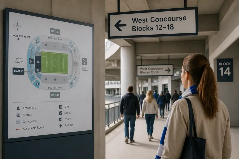
A visitor at Gate C needs Block 14, but the concourse forks before the block numbers appear. A stadium wayfinding map can show where Block 14 sits in the venue; directional signs must tell the visitor which branch to take. The useful question is not which tool wins, but what each can explain at the moment it is needed.
Maps provide a view of relationships. Signs handle immediate choices. Treating them as one system makes it easier to distinguish route planning from route confirmation, and to spot gaps between the two.
Map the information jobs
Start with the questions visitors need answered, rather than with a list of signs to install. Before entering, someone may need to choose a gate. Inside, they may need to connect a stand, a lift and a shared concourse. At a junction, they need a clear direction. Near a block, they need to know they have arrived.
These are different information jobs. An overview map is suited to comparing locations and possible routes. A directional sign is suited to identifying the next action from a particular point. A destination marker confirms the endpoint. None should be asked to do all three.
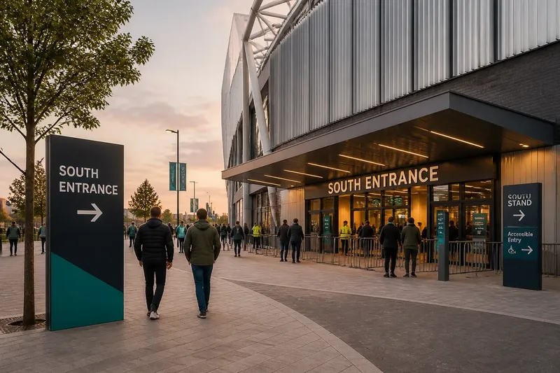
- At the approach, show the entrance names and their relation to the stands. If a visitor cannot match their ticketed gate to the venue, clarify the gate label or its location.
- At an entrance, show the visitor’s position and the main concourse connections. If the map does not make orientation clear, revise its facing cue or “you are here” marker.
- At a junction, show the destinations reachable by each branch. If the direction appears only after the split, move or add the sign before the choice.
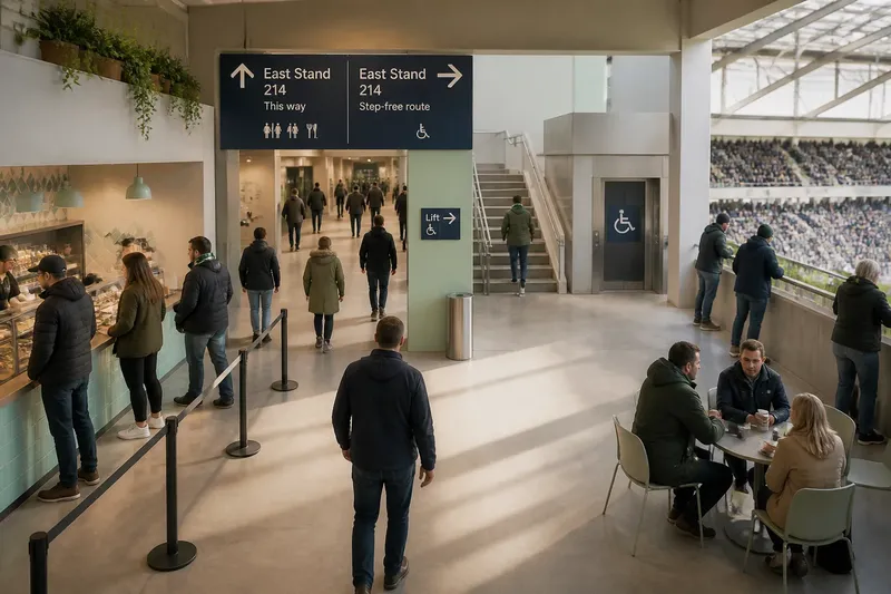
- At a change of level, identify lifts, stairs and the destinations they serve. If the route is unclear for someone avoiding stairs, add an accessible-route direction.
- At a block or facility, show a destination marker. If visitors can reach the area without recognising it, make the endpoint label more prominent.
- On the return route, identify exits or named meeting points. If those names differ from the map, align the public-facing labels.
Keep each message tied to a decision. “Find facilities” is vague when toilets, first aid and accessible facilities are in separate places. Name the destination a visitor is looking for.
Make maps useful for planning
A stadium map should make the venue’s structure legible. Show how gates, stands, concourses and major shared destinations relate, along with the principal routes between them. This helps a visitor decide which way to start and whether a destination is near the entrance or across the venue.
Orient the map to the place where it is displayed. A “you are here” marker without a clear facing direction can leave visitors rotating the diagram in their heads. Use a compass, a “viewed from here” cue or a consistent orientation convention. If the map is mounted beside Gate C, its presentation should make Gate C easy to locate.
Give the most useful features visual priority. Entrances, stands, accessible routes and shared destinations usually deserve more prominence than minor service details. Put secondary information in a legend or a separate panel, so visitors do not have to search through a thicket of labels to find a route.
Use names consistently across tickets, maps and signs. If a ticket says “North Stand, Block 14”, the map should not rename it “Upper North” and the sign should not shorten it to “N”. Stable wording lets the visitor match information without translating the venue’s internal vocabulary.
Use signs for decisions
Directional signs should appear before a meaningful choice. A sign that points back after a visitor has taken the wrong branch is an apology in board form. At a junction, name the destinations served by each direction and make the arrow’s relationship to those words unambiguous.
Repeat the destination label where a route bends, changes level or otherwise becomes uncertain. Repetition helps someone who is checking a ticket, keeping a group together or moving through a busy concourse. It also makes each point usable on its own, without requiring visitors to remember a sign they passed earlier.
Use stable names rather than instructions that rely entirely on temporary surroundings. “West Concourse, Blocks 12–18” remains meaningful if a food counter is closed or hidden behind a queue. A landmark can support the instruction, but should not be its only anchor.
Imagine a visitor enters at Gate C with a ticket for Block 14. The map shows Block 14 on the west concourse; a sign before the first fork points to “West Concourse, Blocks 12–18”; another sign confirms that label after a turn; and a marker identifies Block 14 at the destination. The expected observable result is a route the visitor can follow and verify without memorising the whole map.
Keep maps distinct
Maps and signs are not competing versions of the same message. A map can compare several destinations at once; a sign can direct attention to one choice in the visitor’s immediate surroundings. That difference matters in places where a full venue view would be cumbersome, such as a concourse junction, or where a single arrow cannot explain how distant stands relate.
Choose the format according to the question. Use a map when people need to understand spatial relationships or compare routes. Use a sign when they need the next direction. Use a destination marker when they need confirmation that they have reached the right place. A small map at a junction may help if the routes are genuinely confusing; it should not replace a clear arrow for the next turn.
Consider the viewing conditions, too. A detailed map may be difficult to use in a queue, while a short sign may be missed if it sits behind a column. Give visitors space to stop without blocking the route, and check that nearby fixtures do not hide the information.
Review the route in place
Trace a destination from the approach to its endpoint. At every point where a visitor must choose, change level or confirm progress, check what information is visible before action is needed. Compare the wording with the ticket and the map, not just with the venue’s internal naming system.
- Orientation: Check whether the map shows the visitor’s location and viewing direction. If either is unclear, revise the marker or orientation cue; if both are clear, retain them.
- Names: Compare the ticket, map, sign and destination marker. If the same place has different public names, choose one and update the conflicting labels; if they match, keep the wording stable.
- Junctions: Check whether the direction is visible before each branch. If it appears only after the choice, move or add a sign; if it appears in time, keep its position.
- Turns: Look for a point where the route changes direction or level. If visitors could lose confidence there, repeat the destination label; if the route remains obvious, avoid adding a redundant sign.
- Visibility: Inspect the map and signs with queues, barriers and fixtures in their usual positions. If any message is obscured, adjust placement or reduce competing detail; if it remains visible, leave the layout alone.
- Arrival: Check whether a visitor can recognise the block, facility or meeting point at the endpoint. If not, add or clarify a destination marker; if the endpoint is unmistakable, keep the existing marker.
Where practical, ask someone unfamiliar with the venue to explain what they would do at each decision point. If they pause to reconcile different names, revise the labels. If they can identify the next action without prompting, the information is doing its job.
Which format fits?
What should a stadium map show?
A stadium map should show how entrances, stands, routes and major destinations relate. Give the visitor’s location and the map’s orientation enough clarity to support route choice.
When should a sign repeat?
Repeat a destination label at a turn, change of level or other point where a visitor may doubt the route. The useful interval depends on decisions, not a fixed spacing rule.
Can signs replace a map?
Signs can guide a visitor along a route, but they may not explain the wider relationship between stands, entrances and shared spaces. A map helps when people need to compare destinations or choose a route.
Should maps and signs share symbols?
Use the same names and symbols when they refer to the same destination or service. Explain unfamiliar symbols in a visible legend so a visitor does not have to guess.
Join planning to movement
A stadium wayfinding map is useful when it helps a visitor understand where to begin and how destinations relate. Signs take over when the visitor needs the next direction; markers confirm arrival. Give each format its own job, then keep the names and route logic consistent between them.
When reviewing a stadium wayfinding map, follow one destination from the venue boundary to its endpoint and note where the visitor’s question changes. If the map answers a planning question and the next sign answers the immediate one, the hand-off is clear. If either leaves the visitor guessing, fix that specific gap rather than adding detail everywhere.